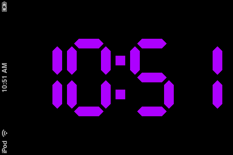
Since last year WebJam™ I am proud owner of shiny iPod Touch. Yes, still shiny. What I found recently that while I am in the office my iPod just wasting space at my desk. Just for fun I decide to create simple web application that will turn my iPod to digital clock while I am in the office.
Just for fun I decide to emulate old LC clock without any images or vector graphics. To make it look like application I have to put special meta tag inside HTML (<meta name="apple-mobile-web-app-capable" content="yes">). The problem with this method is that page doesn’t react to device rotation, but benefit of having custom digits is you can rotate them easily. So, don’t be surprised to see clocks rotated 90° in your browser. Here is a result.

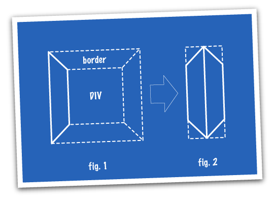
The question is, how I did all these fancy shapes without images? I was using borders. Take a look at fig. 1. If you apply wide border to some element and paint one side in different colour browser will solve graphical problem by creating “photo frame corner”. So, on fig. 2 I show idea: two narrow DIVs with wide borders will create a shape I need. Now in CSS I specify display rules depending on the value of the digit. I didn’t specify colour for borders so they could inherit colour from body text. Now to change colour of the clock I just need to change colour of the body. The rest is easy.
Hope you could pick up some interesting techniques from this example.
Update: Since iPhone/iPod software update 2.2 release had to update CSS a bit.
